 Web and Full Stack
 CMS and Frameworks
 Online Marketing
 Mobile
 Cloud Services
 ECommerce
 Enterprise Services
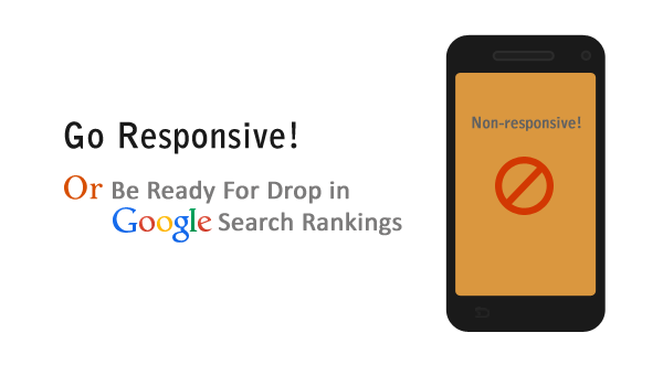
Google has finally taken a clear stance on mobile SEO practices. With more people using their smartphones and tablets to browse the internet, it has become increasingly important to create a website that works across multiple platforms.
But when it comes to SEO, can a responsive layout increase the chances of a website succeeding in the SEO ranking. The answer is a resounding yes, and here’s why.
Google announced algorithm updates that will have a “significant impact” on mobile search results worldwide for mobile searchers. The update improves rankings for sites that provide a mobile-friendly experience to searchers on mobile devices, and, by association, demotes sites that do not.
Responsive web design makes it easier for Google to crawl and index sites as opposed to crawling mobile-optimized websites, which use individual URLs for their desktop, tablet and mobile phone versions. This causes URL redirection.
From an SEO perspective, one of the main challenges posed by having a separate mobile site which do not rank well in search engines, but on the other hand, redesigning your website as responsive will enable you to maintain your backlinks, and will mean that you can focus your SEO on one single site.
Which brings us to our next reason why responsive benefits SEO.