Web and Full Stack
 CMS and Frameworks
 Online Marketing
 Mobile
 Cloud Services
 ECommerce
 Enterprise Services
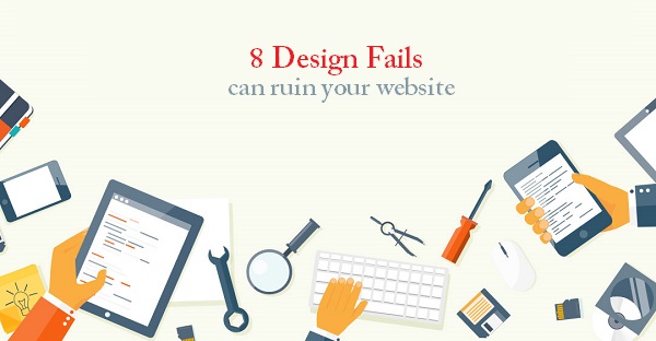
When it comes to web design, there is not much compromise one can make when we talk of good design. There is a very fine line between good and disastrous design and unfortunately, that line is very thin and often blurred. But fortunately, there are some mistakes which are most commonly made and will be listed down below combined with simple and effective techniques on how you can easily avoid them.
Let us look at them one by one in detail:
#1- The use of too many fonts
Sometimes it can be quite a tempting exercise to experiment with many fonts and you might be under the impression that this would add diversity to your website, giving the visitors a better visual experience. However, on the contrary, website visitors actually prefer if you stick to simple fonts and oscillate between 2-3 fonts at the most and use simple typeface for a majority of your content.
How to avoid this mistake: Stick to 2-3 fonts that are easy to read, common and easily understandable.
#2- Don’t over-do the keywords
Of course, the world of SEO implies a heavy importance on keywords but that doesn’t mean that you over-use these keywords which is a practice called keyword stuffing. Google is known to catch practices like these and if found, they also tend to lower your ranking on Search results.
How to avoid this mistake: Be as organic about your keyword placement as can be. If you write remembering the fact that you are writing for human beings, you will face no problem with Google rankings.
#3- Too Many Call-to-actions
When you are running your website, it is very important to set what you want your call-to-actions to be. You might want to invite them for various functions but you can’t ask them to do it all. This has a negative psychological effect on the potential customer as the more options he sees, the less are the chances for taking any kind of proactive action.
How to avoid this mistake: Decide what you want your visitors to sign up for and stick to that with the utmost convenience you can offer.
#4- Music on your website
This one is usually created with the right intention in mind- to give your audience a “WOW” experience from the second they enter your website. Even if you are a music enthusiast or a musician, having a soundtrack or music on your website can be distracting and annoying to the visitor in most cases. Think of where your visitors are accessing your website from-with most people being on the move, they would probably look at music as a nuisance.
How to avoid this mistake: If you have to play music, invite your visitors to click the “play’ button to play music
#5- Low quality images
It’s important to show what your brand truly represents and in most cases, photos are a great way to do that. Images are a great way of showing that and you should never opt for stock images when you have the chance to do it yourself. If the photos that you take are blurry or taken shoddily, visitors will get the impression that you are not serious about your business.
How to avoid this mistake: Authenticity is key! Invest in professional photography or getting images of your products and your store, which would represent your story.
#6-Wide website
Websites that are long are usually examples of well-designed websites but when you experiment not just with the length but also with the width of your website, you tend to fall into the not-so-good category. We have been tuned to scroll down on websites are not oriented towards a wide display.
How to avoid this mistake: Scroll on the website but not horizontally.
#7- Overuse of interactive messages
When you are setting lightboxes, make sure you are conservative in the amount. Interactive messages are very effective when it comes to promoting yourself on social media but having these lightboxes on every page just comes across as a heavily armed marketing gimmick rather than an actual website.

How to avoid this mistake: Create a lightbox that is focused on the most important goal of your website.
#8- No mystery element on your website
A common mistake a website owner could make is leaving everything to be conveyed on your home page itself. You might want to convey your story, your product discounts, your testimonials and everything else on your home page. It is important to not do that and just stick to the important points on your home page like a new collection or category you might be running, while offering links to inner pages.
How to avoid this mistake: Keep it simple. Include a few images, a good and clear call-to-action and content that describes exactly what you do. The details of what you do can be left to the other pages.