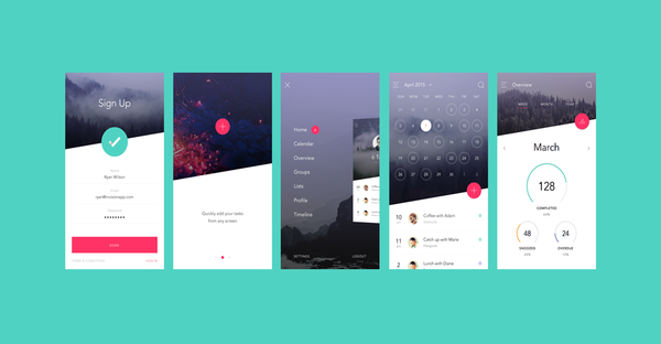
There is a great deal of importance that is being given to the consistency around UI design. Moreover, it has become important to understand that visual consistency is perhaps most important in the field of UX/UI design. So, how would you define visual consistency?
There are several interactions that are taking place between the user and the application and it becomes important to keep the experience simple from start to end. This can only happen with intuitive consistency. The idea of consistency is to keep every element of your design, keeping in mind your user’s expectations and anticipating their responses to each of these elements.
Introducing minimalism in function
Nowadays, developers are understanding the need for keeping the number of functions to browse through an app to an absolute minimum. If you expect the user to learn new functions for each task they have to perform, then it could lead to confusion and becomes a problem of inconsistency. There is a reason why there are different standards on different platforms and this is one of the reasons for ensuring consistency throughout. Simplicity is something that many strive for, however, it can become one of the difficult things to achieve. There are tiny consistencies that could sometimes go unnoticed such as the type of font you use, the color etc.
Consistent language
It is extremely important to maintain consistency throughout, in the form of the language that you use. For the sake of illustrating this point, let us take the example of a website. You might have decided to adopt a friendly tone throughout your website’s pages, however, when it comes to a call-to-action or an error message, you might come across as intimidating or less friendly. These small differences can make a huge impression on the psychology of the consumer.
There is a reason for having a standard
This is something that could be conflicting for many developers but unfortunately or fortunately is one of the main things one needs to look out for. The reason for there being a standard that exists is because users have gotten used to looking at applications and websites in a certain way. For example- they will look from left to right so it makes sense to have your brand logo on the left. There should be no reason for disorienting the consumer unless that is a deliberate strategy.

This can also translate into the kinds of elements that you use. When, as a developer, you are creating certain functions/elements that have a specific meaning, it is important to design those elements in the way users are used to seeing them. For example- a checkbox does imply that you have to choose from multiple options and the association is with the particular checkbox as an element of your design.

 Web and Full Stack
 CMS and Frameworks
 Online Marketing
 Cloud Services
 ECommerce
 Mobile


